PlatePost x KCH
How an AI-powered navigation bar transformed a scroll-heavy menu into a seamless ordering experience, and laid the foundation for a scalable design system.
Client
Figma, Framer, Claude AI
Year
2026
Project type
Consumer Product Design
Credits
Product Designer

Building the Nav Bar for Kei Coffee House
How an AI-powered navigation bar transformed a scroll-heavy menu into a seamless ordering experience, and laid the foundation for a scalable design system.
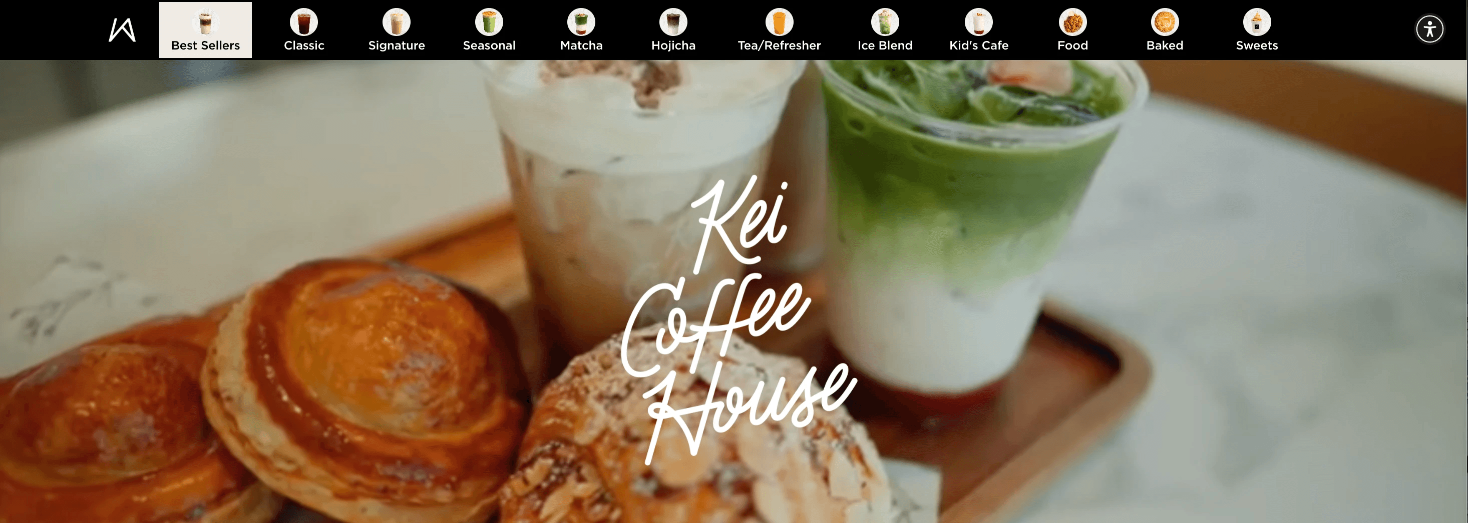
The scrolling problem
Kei Coffee House has a rich, extensive menu. Classics, signature lattes, matcha, hojicha, seasonal specials, food, baked goods, sweets, and more, all living on one long page. For customers browsing on their phones, finding a specific item meant scrolling. And scrolling. And scrolling some more.
There was no shortcut, no landmark, no way to jump to what they were looking for. Customers who knew exactly what they wanted still had to wade through the full menu to get there. It was friction that compounded with every visit.
"Customers had to continuously scroll downwards with no way to quickly jump to what they were looking for."
The solution: an AI-assisted nav bar
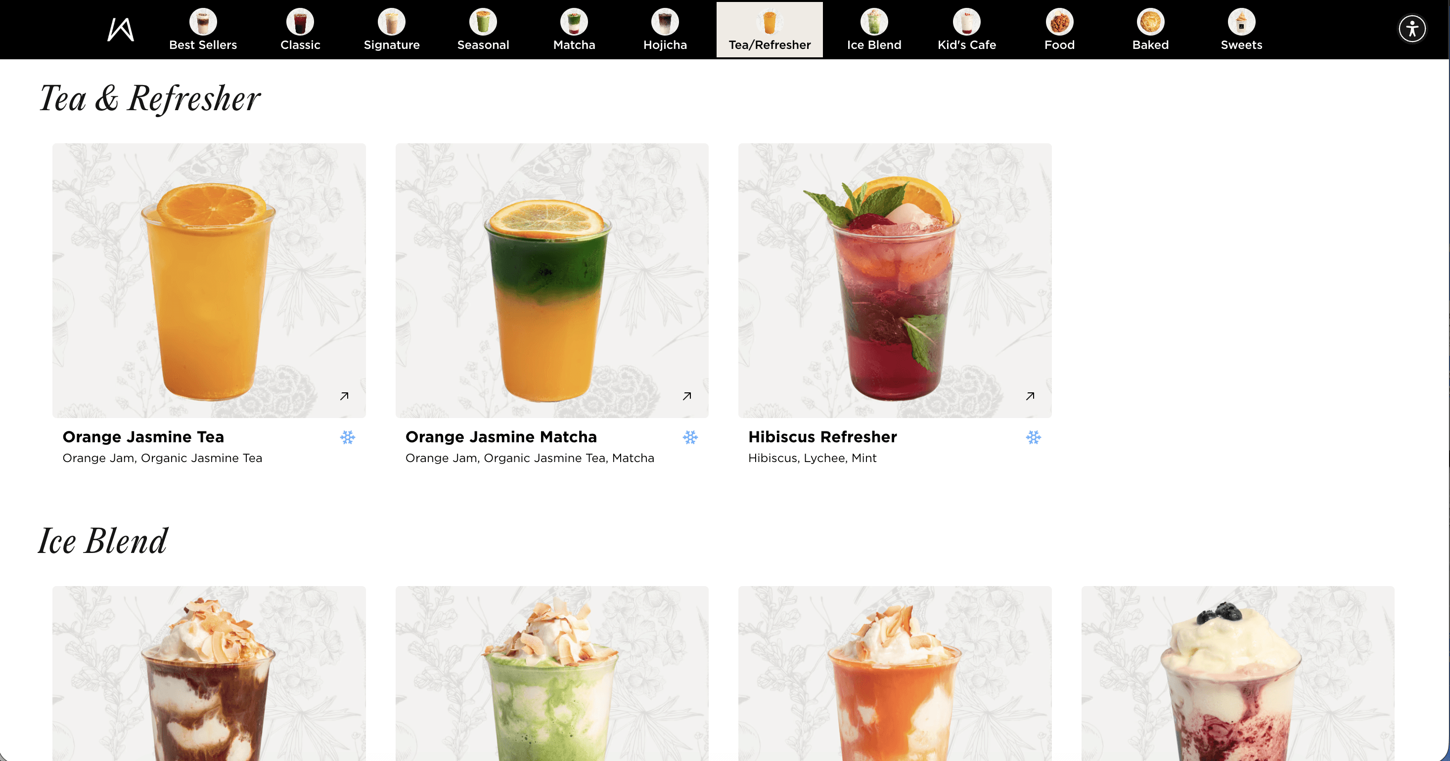
Through PlatePost, I built a sticky navigation bar that auto-generates category anchors from the menu content, powered by AI to intelligently parse and group items regardless of how the underlying menu is structured. Customers can tap a category and land exactly where they need to be.
The nav bar surfaces at the top of the page, stays accessible as you scroll, and highlights the active section as you move through the content. What used to take a dozen swipes now takes one tap.
Live nav bar on platepost.io/kch
Kei's menu spans 12 categories. Without navigation, customers were expected to mentally hold all of that while scrolling. The nav bar surfaces that structure immediately and makes it actionable.
The interface in context
The nav bar anchors to the top of the page and stays fixed as customers scroll. Each chip corresponds to a section, and the active state updates as you move through the menu.
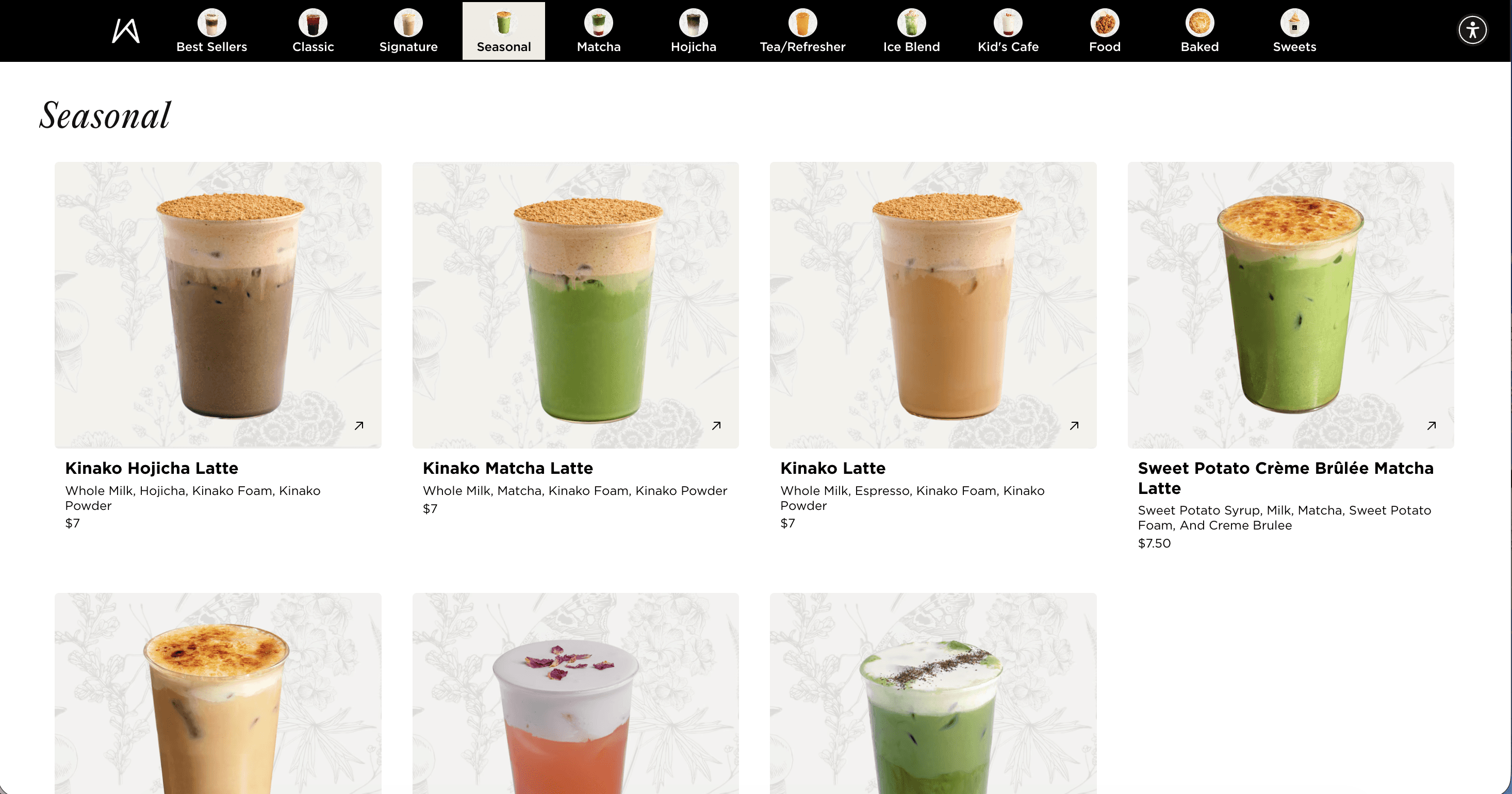
Nav bar with category chips, active state shown in beige.
Scalability by design
One of the most deliberate decisions in building this feature was keeping customization surface-level but high-impact. The nav bar is designed to feel native to any brand without requiring a full redesign each time.
Onboarding a new client is as simple as swapping the primary color and logo. The entire nav bar adapts instantly.
The bar's color, active state, and chip styling all inherit from a single brand token. For Kei Coffee House, that is a warm earthy gold that matches their visual identity. For a different client, it would be their color with zero code changes.
A look at the menu
The breadth of the Kei menu makes the navigation problem tangible. Across 12 categories, customers can find specialty lattes, seasonal drinks, baked goods, Filipino-inspired food, soft serve, and more. Each category needed a clear anchor, not just a scroll target.
Impact
The nav bar turned a browsing chore into an intuitive experience. Customers arrive at their destination in one tap, and the menu finally reflects the quality of what Kei serves.
What I learned
Navigation is often treated as an afterthought, something bolted on after the content is in place. But for content-heavy pages like restaurant menus, the nav bar is the product. Getting there fast is the experience.
Building with scale in mind from day one changed how I approached every decision. The color token system, the AI-parsed categories, the anchor-based scrolling: each one was designed to work for any client, not just Kei.
Next project

Favs