Favs
In a social media landscape built around ads and influencers, Favs is trying to do something genuinely different. Here is how I designed the screenshots that had to say that in under three seconds.
Client
Figma
Year
2025
Project type
Consumer Product Design
Credits
Product Designer

Designing the app store screenshots for Favs
In a social media landscape built around ads and influencers, Favs is trying to do something genuinely different. Here is how I designed the screenshots that had to say that in under three seconds.
The noise problem
Social media in 2024 is loud. Feeds are optimized for watch time, not wellbeing. Ads surface between every third post. Influencers crowd out the people you actually care about. Meanwhile, real friendships quietly atrophy in the background because nobody built a product that helped you maintain them.
Favs set out to fix that: a social network with no algorithmic feed, no brand accounts, no ads. Just you and the people who matter. The challenge handed to me was not the product itself. It was earning the download in the first place.
"You have roughly three seconds on a search results page. The screenshots either make the case instantly or the user keeps scrolling."
The screenshot problem
App store screenshots are not marketing material in the traditional sense. They sit in a small strip on the search results page, viewed by someone who has already decided they might be interested. The job is not to convince. It is to confirm: yes, this is what you think it is, and it is worth your time.
Most social apps default to lifestyle photography and generic headlines. For a product with a mission as specific as Favs, that approach would have buried the point. The screenshots needed to do real communication work.
Research before design
Before opening Figma, I spent time on app store optimization research to understand what actually drives downloads. I analyzed competitor screenshots across established social apps and newcomers targeting similar audiences. A few things became clear quickly.
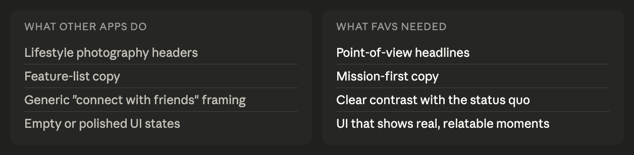
Competitors leaned heavily on feature lists and screenshots of empty states. None of them led with a point of view. That was the opening.
Leading with a point of view
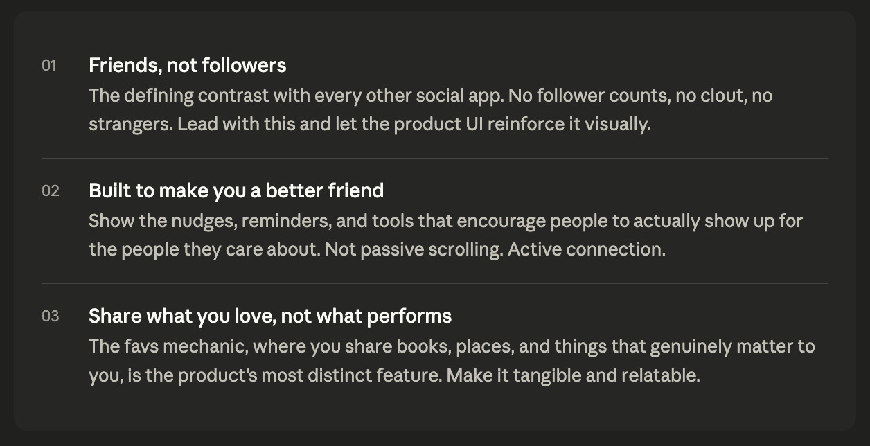
The Snackpass Kiosk design had a clear north star: mission unpausable. Every decision traced back to one problem worth solving. I applied the same lens to Favs. The mission was not "a new social app." It was "a social network that helps you be a better friend." That had to be the first thing someone read.
I worked with the CEO to identify the three ideas most worth communicating, in order of priority.
Design decisions
With a clear message hierarchy, the design process became a series of decisions in service of those three ideas. Every element earned its place by supporting one of them.
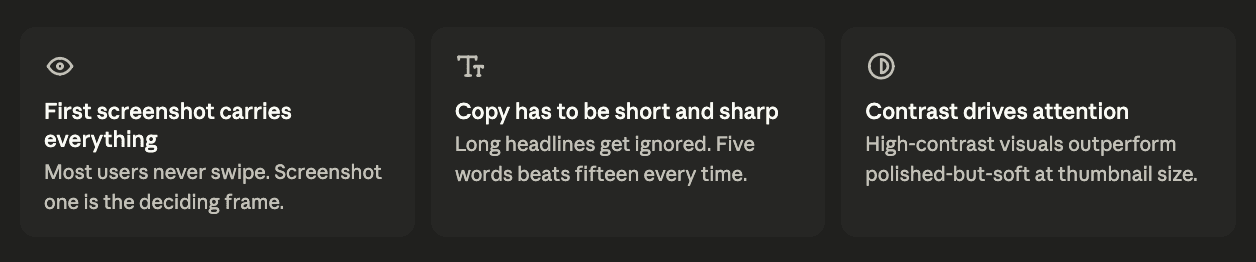
I kept the typography minimal and intentional. Short, punchy headlines in the upper third gave each screenshot an immediate read at thumbnail size. The UI beneath demonstrated the concept rather than explained it. The goal was to show, not tell.
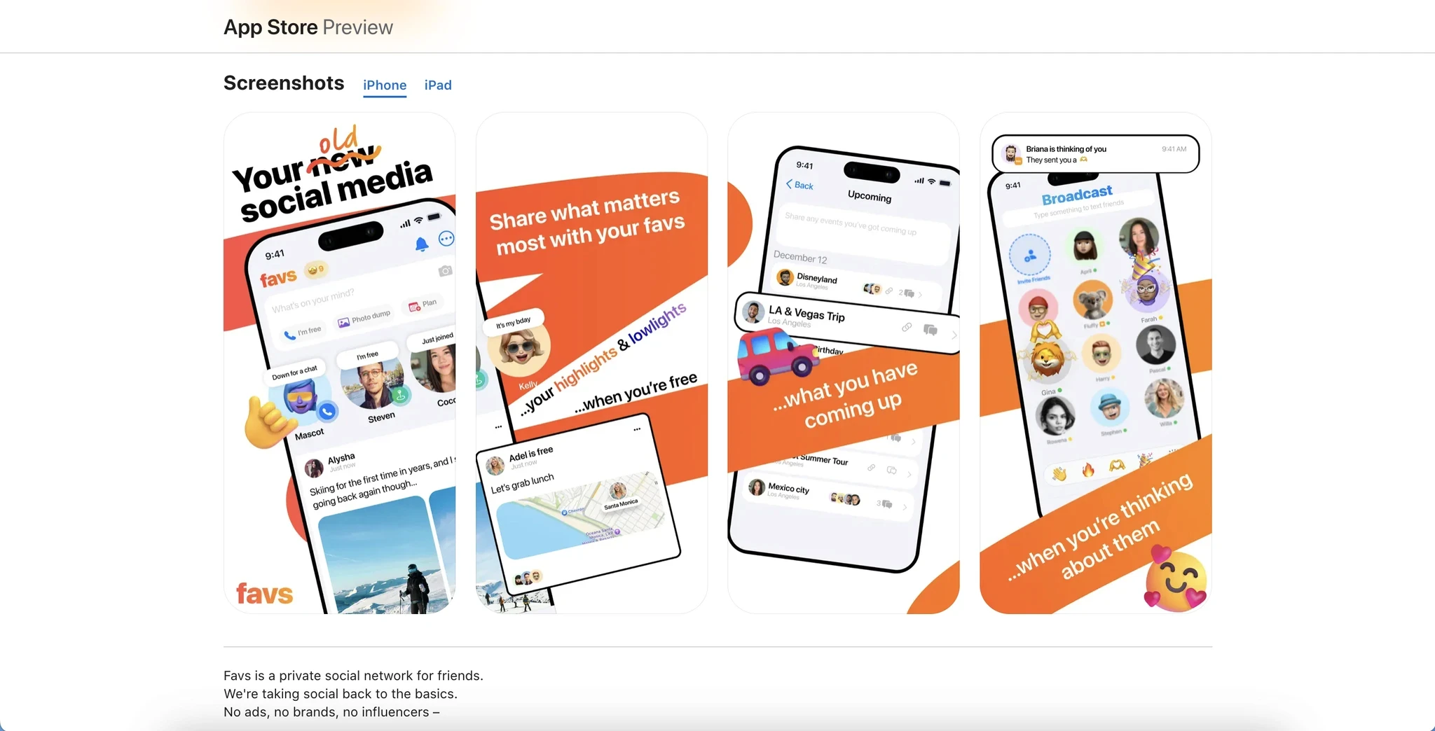
Color served the mood as much as the brand. The dark palette of screen one communicated intimacy and focus. The lighter, warmer screen two shifted the tone to warmth and care. Screen three returned to darkness to frame shared favs as something personal and considered, not performative.
Working with the CEO
Throughout the process I collaborated closely with the CEO to make sure the visual language matched the product vision. The screenshots were not just a design artifact. They were a statement of values. Getting that alignment early meant fewer revisions and more confidence in the final direction.
We pressure-tested each headline against the question: if someone read only this and nothing else, would they understand what Favs is for? Every line that could not pass that test got rewritten.
Outcome
The final screenshots led with a clear mission, showed the product doing real work, and positioned Favs as something meaningfully different from every other app in the category. The design process treated the screenshots not as decoration but as the first real conversation Favs gets to have with a potential user.

What I learned
The most important design decision was not a visual one. It was choosing what to say. App store screenshots fail most often not because of poor execution, but because the designer never committed to a single idea worth communicating. Everything else flows from getting that right.
Collaborating with the CEO early also reinforced something the Snackpass Kiosk process confirmed: the best outcomes come when design and leadership are aligned on the problem before the pixels start moving.
Next project

From: Miku To:You